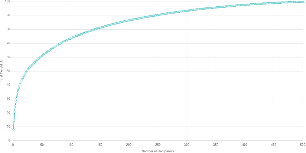
I know it is a small graph, but it shows the “concentration” in the S&P index of SIX companies making up 30% of the market capitalization.
This graph is from slickharts, and shows the percentage of Total S&P weight vs the number of companies.
This is NOT diversification, IMHO.
Copyright © 2025
Legacy Wealth Management

